Achieving Operational Value
It's 11:25am, about 6 months after the arrival of Dan's new monitor, and he finds himself in FCG's cafeteria, attempting to beat the noon rush. Things at FCG have been relatively quiet over the past few months. With much of the operational care-and-feeding of the IT department behind him, Dan has found himself working on strategic initiatives in other places to widen the scope of the company.
Dan has always liked FCG's cafeteria. They brew a decent cup of coffee, and he usually makes his way down for seafood day on Fridays. As COO, one of his early responsibilities was in finding just the right catering company, and he always felt pride in having chosen one of the best.
Picking up his tray and working through the line, Dan runs up upon John Brown. John's attention appears divided between the potato-encrusted tilapia and the company announcements displaying on the television mounted on the wall above the cafeteria.
"Long time, no talk to, eh John. How're things going in IT these days?" asks Dan to his apparently distracted IT Director.
John looks deep in thought, taking an extra second to respond to Dan's question, "Not bad. Not bad at all... Hey, have you been paying much attention to these new TVs that Facilities has mounted all around the company? They're using them as a tool to show company announcements and other news. You know, like quarterly revenue goals," he motions to the chafer holding today's fish entrée, "…and today's tilapia special."
Dan beams, "Actually I have. They were originally my idea. I was having lunch with one of our customers a couple of months ago and saw something much the same there. Thinking about how tired I was getting of seeing all those 'company news' emails, I realized what a great idea they were for getting that kind of info to people. So, I bought about a dozen flat-panels and had them strung up all over the place. What do you think?"
"I love the idea," John says, staring at the news of the day, "but I'll admit they are distracting when I'm trying to decide between the sandwiches and the special o' the day."
"Try the tilapia. It's my favorite. Hey, have you seen the last set of profitability reports? We're up 15% over last quarter," comments Dan.
John looks at Dan suddenly, the look of a light bulb going off in his eyes, "No I haven't… Dan, I just had an amazing idea. We've got to sit down and think about this a little. Have you got a few minutes?"
Dan blinks, "Sure. An amazing idea, eh? Alright, I'll do even better. If this idea is as good as you say, then lunch is on me."
Both men grab their lunch and sit down at the tables close to the cafeteria line. John makes sure to position both men so that they can see the television showing the news of the day.
"The system we in IT put together to relay that information to the televisions is pretty extensible," John says, pointing to the television, "All we need to provide it is a network location of something we want to display—a PowerPoint deck, a Web site, or even a video stream—and it'll play it in any order that we want. Most of the time we're just rotating the PowerPoints HR puts together with the news of the day. They're set to update every 6 seconds." "OK," Dan comments, "that's why be bought the system. What's your idea?"
John sits back in his chair, still with that light-bulb-going-off look on his face, "Here's my idea. That BSM system that we've been using for a while, we've pretty much got the configuration of that system down pat. We're using it as a tool in IT not only for monitoring but also as a central location for many of the otherwise disparate management toolsets we used to use. You and the other executives and financial types are using its data to keep you up-to-date on our financials. Even our customers are now getting to see parts of it, what with the new status and outage notification screens that it automatically drops onto the Web site when we're having issues." "Go on," Dan urges.
"Well, with these new TV's, we've got a new tool whereby we can keep the whole employee base informed about the status of our company. What if we started providing up-to-the-second info on our financial status from BSM? How well we're meeting our goals. How well we're doing with sales. Those sorts of things," on fire now, John continues, "Kind of like a tool for keeping morale up when we're doing well financially. When we're not doing so well, it can serve as a reminder that we need to buckle down. Fiscal transparency to the employees, and all that."
John continues, "All that data is already in BSM in real-time. All we need is to create a new dashboard to display it. We'd have to be careful about providing too much info so we're not giving away any secrets. But we could put together some dials and heat charts with generic 'fiscal health' info. We'd just rotate that Web site with HR's info and the special-of-the-day. What do you think?"
"Interesting. I think I owe you lunch," says an impressed Dan as he picks up the check.
Post-Implementation Operational Achievement
As with any investment, getting the most return is critical to determining its worth to the business. A BSM system's internal calculations engine itself is involved with the determination of value and return. This determination works not only for the systems it monitors but the same calculations associated with return can be used to validate the BSM system itself. As such, BSM, through its measurements and internal financial calculations, is capable of determining that value.
As you can see in Figure 7.1, at the highest level, a BSM system is intended to be a sort of black box. Being input into that box is a set of raw data arriving through its own End User Experience instrumentation or through various connectors that plug into other management systems.
Back in Chapter 5, we talked at length about how EUE augments traditional monitoring with a validation of how the user is experiencing the system. Other connectors that comprise BSM's data ingest were discussed at a high level in Chapter 4. In our next chapter, we'll discuss those connectors in much more detail.
On the right side of Figure 7.1, we see the output of BSM's calculations. These are a series of visualizations that can be used to validate system health, understand the financial impact of IT systems, and ultimately make decisions based on data that has been formatted into a digestible format.
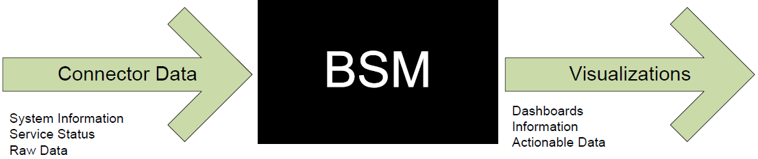
Figure 7.1: In many ways, BSM's internal computational logic is like a black box. Raw data from connected systems goes in one end. Visualizations of that information in digestible formats are output on the other end.
Our chapter example involves a story whereby FCG is using the internal financial logic within their BSM installation in new and unique ways to provide value to their general employee base. As you'll see in this chapter and hopefully throughout this guide, BSM's ability to gather and integrate data is comprehensive and covers many areas within IT. The only limitation is in your own imagination to develop dashboards and other heads-up displays that are useful to their consumers.
In this chapter, we'll discover some of the ways in which added return can be gained through the implementation of a BSM system. Much of that return comes through the reduction of operational expenditures on the part of any dashboard consumer. As Figure 7.1 shows, we'll focus our attention in this chapter on the ingest and output portions of a BSM system, and how BSM's involvement with those linkages enhances its return to the business. Specifically, we'll talk about BSM's capabilities to operate as a management umbrella, consolidating many traditional management consoles under its unified interface. We'll then discuss BSM's visualizations and how their extensibility allows them to be used for many different classes of users. We'll conclude this chapter with a look at the various data blocks that can be made part of a dashboard.
Reducing Operational Expenses (OPEX)
As is explained in the narrative that makes up our chapter example earlier, BSM's black box makes it highly useful for the formatting of raw data into formats that make sense to multiple classes of users. Executives and financially based users can leverage the financial information to gain a real-time understanding of the role of IT-based income to the business' bottom line.
At the same time, other users can benefit from this information as well. As we'll see in a second, BSM's functionality can become a management umbrella, under which many common management tools can be unified. BSM includes the ability for IT service measurement and reporting, both from the perspective of IT as well as the customer and the business. By unifying disparate management tools and adding a business-oriented layer to IT service management, this reduces operational costs especially around problem resolution processes and the impact of problems on the business.
Also possible in consideration of this black box is the extensibility of the information that can be provided to users. With the horizontal scaling of a BSM system's user base—like what was done with the televisions in our chapter example—BSM's toolsets have the ability to reduce the overall operational expenses associated with managing IT systems.
BSM Correlates and Consolidates to Make Sense of the Data
Let's start by looking at the management tools that are necessary in the operation of any IT environment. In order to properly understand the communication between individual elements on the network as well as to quantify the health of systems, various types of management tools are often used. As Figure 7.2 shows, these tools can be comprised of systems management and monitoring systems, application monitoring systems, and others. Each of these has a role to play within the environment:
- The application monitoring system watches the applications in an environment, compares them with baseline performance, and reports when applications fail or perform outside their expected ranges.
- The systems monitoring system ensures that systems are running properly and verifies that servers and networks are running to pre-established baselines.
- The Service desk to tie in incident logging, categorization, prioritization, etc.
- The CMDB as a repository of information that represents the authorized configuration of the significant components of the IT environment. A CMDB helps an organization understand the relationships between these components and track their configuration.
- The systems management system augments all of these by enabling the baseline itself, providing for policy-based and centrally controlled changes to the environment as well as the maintenance of system configuration.
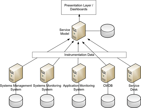
Figure 7.2: The information from and activities associated with disparate management toolsets can be centralized through the BSM implementation where business rules are applied to make sense of all the data
BSM's black box allows for the aggregation of instrumentation data from each of these systems into a single location. More importantly, its calculation engine allows for the relation of information between individual management systems. As BSM comes equipped with its own suite of tools for acting on the information it receives, it uses the service model to apply business rules – taking data from disparate source and turning it into information that is meaningful to the business. It is possible to use the BSM system as the overarching umbrella for the management of many facets of an IT environment. In the next few sections, let's take a look at how this can be done through the connection of BSM to the other management systems in an environment.
Unifying Management Controls
The number of individual management controls within any IT environment is often large. As individual toolsets, they can be challenging to work with in combination. Though each of these tools can be segregated in function and by product, the types of activities desired out of each control are often relatively similar across all IT infrastructures. The daily administration of an IT environment, no matter what the industry or company size, is usually the same. Many of the same types of actions are necessary in order to best administer the environment:
- Management tools. Most organizations have several management and monitoring tools already in place. While a BSM system doesn't replace these existing tools, it makes it easy to integrate data from other IT infrastructure management products, service desk software, configuration management databases and other applications across multiple platforms. BSM compliments management and monitoring tools by "filtering out the noise" and turning multitude of IT data into information that makes sense to the business.
- Notification. In the same vein as with management toolsets, notification elements can also be segregated. Network element notification can be enabled through one protocol and service while server and application notification are enabled through an entirely different one. When notification systems are segregated from each other, it grows challenging to identify root causes in an environment as notifications associated with one part of the environment source from one location, while other notifications source from elsewhere. When BSM ties into segregated notification systems, this centralizes the point of notification and eases the pain of discovery.
- Reporting. Lastly, reporting on the activities within the IT environment is usually different in form and function based on the system performing the reporting. When multiple systems are used to manage reporting in an environment, problems are likely to surface associated with the desire to relate items identified in one system to those in another. BSM's internal calculations provide a mechanism for system data to be related to each other for this purpose.
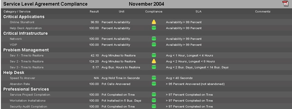
Figure 7.3: An example of how BSM calculations can be inputted into the system. Here, the calculations are used to validate network SLA compliance. The information gathered to fulfill these calculations can come from many different sources
Operational Visibility
BSM also provides return in terms of the overall visibility and control into IT systems. As IT systems are based on intercommunication between hundreds or thousands of disparate elements all residing on a common network, it is not possible to "see" the environment in a physical sense. Instruments are necessary to do the "seeing" for its operators. These instruments, provided by the point monitoring tools and the data aggregated into the BSM solution, provide a human-readable representation of the health and operation of services on the network. This representation provides value to the business in a few key ways:
- Situational Awareness. When instruments are provided with the best possible data in which to perform their calculations, the users of an environment get the best possible understanding of the function of that environment. Situational awareness refers to the ability for a system's users to recognize what is going on within the network. BSM provides this through the translation and reduction of huge quantities of data into levels that are consumable by its users. Later on in this chapter we'll talk about some of the individual data blocks that are used in BSM visualizations to enable this.
- Prioritization of Resolution According to Business Impact. Associated with the visibility of systems is also the recognition of how best to impact change upon them. When issues occur, it is often difficult to understand which are causing the most impact to the user base. A problem that at first blush appears to be of greatest importance can actually be of little impact to users. BSM's calculations of user impact associated with revenue impact helps IT prioritize problem-solving to the issues that need attention the most.
- Characterization and Resolution of Problems. Along with the point above is the proper understanding of the problem itself. BSM's incorporation of data from multiple types of monitoring systems as well as its own EUE instrumentation gives the troubleshooter the necessary awareness of the problem itself.
- Identifying Fault Domain & Root Cause. Because problems at the outset might be masked by other factors, the largest time in component problem resolution in IT is typically spent in problem identification. Finding the location where the problem exists, the "fault domain", as well as the actual source of the problem itself, the "root cause" is challenging without proper situational awareness. Lacking these capabilities, IT can spend too much time tracking down a problem in the wrong location. BSM's toolsets, especially with its agent-based and agentless EUE monitoring goes far into identifying the individual transactions related to the issue. Reducing the time spent in problem identification mode can significantly reduce the operational costs of that problem, as its time-to-restore metrics are greatly enhanced.
BSM as an Extensible Visualization Tool
Thus far we've talked about the use of BSM as a tool to centralize the management of its ingest connections, those to the left of the black box in Figure 7.1. But, as we've discussed numerous times before, BSM's primary mission is to provide a way in which digestible data can be viewed to multiple classes of users. This capability enhances the decision-making powers of those that make use of this data. It provides measurable and quantifiable metrics by which IT and businessbased decisions can be made and ultimately justified.
The chapter example at the beginning of this chapter was written specifically to illuminate how those visualizations can be leveraged by multiple user classes. As John says to Dan, "We're using it as a tool in IT not only for monitoring but also as a central location for many of the otherwise disparate management toolsets we used to use. You and the other executives and financial types are using its data to keep you up-to-date on our financials. Even our customers are now getting to see parts of it, what with the new status and outage notification screens that it automatically drops onto the web site when we're having issues."
What we see in this interchange is the extensibility of the data that comes out of BSM's internal calculations engine. The same raw data that provides financial specifics to Dan can be reformatted into more generalized information for consumption by the employee base. This illustrates how BSM's calculations and its visualizations work hand-in-hand to provide the necessary situational awareness for each user class. In the section following this one, we'll talk about some specific examples of visualization data blocks that can be used to describe data as part of these calculations. But first let's take a look at three example classes of users who can recognize return associated with BSM's data.
For each class of user, we'll talk about a short set of metrics of value. Management users appreciate financial information, while IT wants to know the status of the services they're chartered to support. Customers of the business service want to know the status of that service, when it may be down, and when they can expect it to return to service.
For Management
Management and executives find value in BSM's summarization of the transactions being made within monitored business services. This group of people is incentivized to ensure the current and future profitability of the company. When companies make use of business services and IT as a function for bringing income into the company, any situational awareness associated with the rate and movement of that income is of value to this group.
Moreover, as the level of resolution increases for the data provided to this group, they become increasingly better capable of making decisions about the products transacted through the business system. They can make business decisions regarding changing those products. As an example, they can alter the product's presentation, or market them in different ways. When those events occur, this group through the data presented to them can see immediately how those activities relate to the rate of sale or other factors of importance.
It's important to mention too that products are not the only focus for BSM's financial and management visualizations. If BSM is tied instead into services managed by the business system, the same kinds of monitoring and visualizations can be provided to management.
If you take another look through the example visualizations shown in Chapter 6, you'll see that many of the sample implementations there relate to service-based industries and the continual improvement associated with their activities.
- KPIs. Key Performance Indicators are a central and critical meter for this group of people. At the management level, KPIs often measure the performance of the business as a financial unit. Without delving into specific kinds of KPIs, in traditionally manual systems these valuable indicators may be presented to management only at intervals. Decreasing the quantity of time between these intervals increases the resolution of the data. It increases the quality of the information being provided to management. BSM does this by measuring and reporting on KPIs in real or near-real time.
- Overall Service Quality. Related to business metrics and KPIs is the overall measurement of service quality as a whole. This single metric provides to management a singleglimpse understanding of the functionality of the business system of interest. As we'll see in the data blocks later on, visualizations associated with overall service quality can be created in ways to make it very obvious to management the exact point when service becomes degraded and when it again returns to acceptable service. Knowing this information assists them with performing their management duties.
- Business Impact. Related not only to the quality of the service being provided to a system, but also to the area in which problems are resolved is the idea of business impact. When overall service quality is reduced for a service below acceptable levels, some activity or element is the cause of that change. Often, multiple problems are present simultaneously on a system. It is important that available resources be assigned to fix those problems with greatest business impact first. The measurement of business impact provides management with critical information to this end.
For IT
IT's needs can be much different than those of business management. Whereas business management concerns themselves with the viability of the company as a whole, IT's responsibilities are scoped towards management of the computing environment. As such, IT will be interested in validating the health and functionality of systems that drive business services. In stating this, it is important to recognize that the same types of ingested data that fulfill the needs of management are often used to populate metrics for IT. In terms of providing return back to IT, some of the following metrics are valuable to IT's daily activities and long-term planning:
- Service Level Statistics and Compliance. Mature IT organizations should have mature SLAs in place for managing their relationship with the business. As stated in previous chapters, the problem with many SLAs is in determining the quantitative measurement of their fulfillment. As a manual task, this can be highly time-consuming and provides results only at intervals. The calculations within a fully-realized BSM instance can do this automatically and at regular intervals. By providing proactive SLA information at more regular intervals, IT can better gauge how changes to the environment directly impact service quality.
- Mean Time to Restore. Problems within IT environments are a fact of life. Issues with complex computing equipment happen all the time. Managing how those problems are resolved is one of the major tasks of IT management. The fulfillment of this metric helps IT understand how well-positioned are their resources. It also helps them reposition resources to better fulfill problem resolution.
- Application/System Performance and Availability. Performance and availability in terms of both applications and individual systems assists IT with identifying bottlenecks within systems. When either of these components experience low performance, hardware upgrades may be likely. Measuring this performance over time helps IT plan for these needs ahead of time, preventing costly short-fuse upgrades. In terms of availability, IT's long term measurement of availability helps justify purchases as well as validates the work being done in support of their systems.
- Affected Users. As discussed above, identifying the affected users and the level of affected users assists in positioning troubleshooting resources in the best way possible. When multiple problems occur simultaneously, relating the problems to the number of users being affected by the problem means that higher-impact problems are resolved first.
- Application Processing Provisioning. Lastly is the identification of levels of resources needed by individual application processes or threads. When throttling is enabled on system resources, BSM provides data to assist IT with identifying the correct levels of resources to provision.
For Customers
Customers are a different group entirely than the other two discussed in this section. As external Customers are typically non-trusted or semi-trusted members of the computing environment, the level and type of data provided to these people should be much less than internal employees. As discussed in our chapter example, any data released to televisions around the corporation will likely need to be highly scrutinized to eliminate the probability of disclosure of sensitive information.
That being said, "customers" of a business system are often outside the organization. Thus, as the ultimate end-user of the system, they are most likely to want to know information about overall system status. Three good metrics are helpful to end-user customers that provide this level of information:
- Scheduled Outages. When a BSM system is integrated with a notification system for scheduled outages, this enables end-users to get rich alerting. Consider the problem of being an end-user when this information is not available. When a scheduled outage causes the system to be unresponsive to the end-user, if they have no information about the timing of the outage, they are forced to re-attempt entry at regular intervals until the system is again responsive. This involves a time cost for the end-user. By providing them with a notification that shows when the system can be expected to be again available, they can attend to other tasks until the expected return-to-service time.
- Outage Notification. Outage notifications are similar in concept to the metric above, but also include unscheduled outages. Similar to the problem outlined above, when a business system experiences an unscheduled outage due to a problem, being able to provide users with a notification about the problem lets them determine their next course of action. Ultimately, providing more information of this type to the user means greater user satisfaction during non-nominal periods.
- Infrastructure Status. When simple outage notifications are augmented with additional data regarding individual components of the business system, this status information can also be of value. Providing information about individual system status helps more technical users with better explanations about the activities they're seeing currently onsystem.
With rare exception, any data provided to end users regarding the status of their experience helps increase their level of satisfaction with the system.
Example Visualization Data Blocks
In this chapter, we've talked in general terms about the types of return associated with some of BSM's potential user classes. Here, we've discussed how BSM's visualizations help in providing valuable information to those users to assist them with making decisions and managing the system as a whole. But pictures are each worth a thousand words. The hard part with the general terms used to this point is in truly understanding the types of visualizations that can be used within a dashboard or other interface.
In this section, let's take a visual tour of some examples of data blocks that can be part of a dashboard. These are intended to be examples only. Depending on the BSM solution chosen, these data blocks may look slightly different. Others may be available or those shown here unavailable within the software package. The intent with this section is to provide a representative sample of the various ways in which data can be represented visually through the interface. For each sample, we'll include a short description of the type of data block and in what types of implementations it may be found useful.
Availability Charts
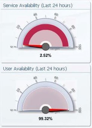
Figure 7.4: A representative sample of an availability chart.
Availability, either in terms of user or service availability measures the quantity of time over a period in which a service can be used by its consumers. Depending on whether we're measuring that based on the service itself or the ability for its users to make use of that service, we may want to include two metrics.
The charts above measure this timing over a period of time, in this case 24 hours. By providing this measurement, the viewer can see immediately the overall health of the system.
Control Charts
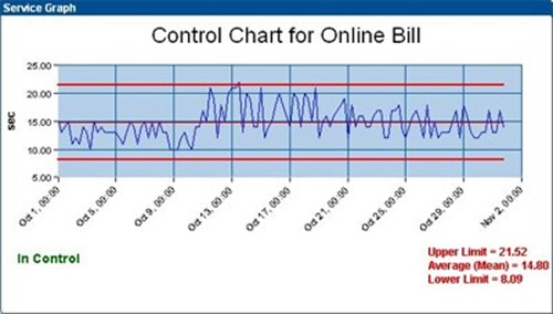
Figure 7.5: A representative sample of a control chart.
Control charts are general tools for relating numerical information. They are used to measure the value of a metric over a period of time. The metric in the chart above is irrelevant to our discussion. What is important is that any metric of interest can be measured over a preconfigured period of time using these types of charts.
Dial Charts
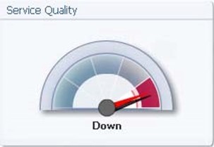
Figure 7.6: A representative sample of a dial chart.
A generalization of the chart used above to measure availability is the dial chart itself. Dial charts are handy for both financial as well as IT-based metrics because of the very obvious way in which they relate their data. Typically "bad" levels associated with metrics are associated with the left side of the dial. "Good" levels are put on the right. We say "good" and "bad" here rather than "low" and "high" because with some metrics the "high" value may represent a "bad" condition. As you can see in the example above, the metric for "service value" is used in this chart, but any bounded metric can be used with this type of data block.
Metrics Charts
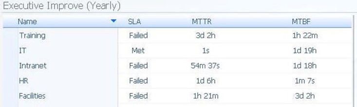
Figure 7.7: A representative sample of a metrics chart.
In some cases, actual values may be of interest to the consumer rather than a graphical representation. In these cases, metrics charts can provide actual numerical values associated with the metrics being gathered by the system. In the case above, we are measuring the "Mean-Time Between Failures" and "Mean-Time to Restore" metrics for a series of elements. For each, a value associated with the meeting or failure to meet the SLA is also positioned.
Metrics charts are generic in that any values that relate to each other can be used in the same chart. Also handy is the addition of rules to metrics charts for particular columns. As an example, in the chart above the value of the SLA column can be configured not as a direct measurement but instead as a test based on the values of the other columns. This feature allows the data block author to provide text values for numerical measurements when added clarity is needed.
Pareto Charts

Figure 7.8: A representative sample of a Pareto chart.
Pareto charts are a type of bar chart that measures multiple values and plots them in descending order from left to right. In the case above, the bar charts starting from the bottom are read left to right with the instance of highest value on the left. Values are often related to percentages, but this is not required.
Pareto charts also show for each value the cumulative percentage associated with the metric measured. In the case above, the actual value for IT approximates 47 to 48 units of outages. That integer value represents 40% of the total quantity measured across all elements in the chart. As the line graph moves from left to right it represents the cumulative percentage associated with each elements bar and those to its left. This depicts the top sources causing problems to the overall service with IT being the first, intranet being the second, and so on.
Pareto charts are most often used to measure quality. Their main purpose is to highlight the most important factors among a set of factors.
6 Sigma Charts
Figure 7.9: A representative sample of a 6 Sigma chart.
When success and failure of processes can be measured quantitatively, the use of 6 Sigma charts can be helpful in providing a visual notification of process quality. We'll talk more about 6 Sigma in Chapter 9, but for now know that these charts show the level of successful and failed processes instantiations over a period of time. They are handy in finding areas in which processes are failing at inappropriate levels.
Outage Impact Charts

Figure 7.10: A representative sample of an outage impact chart.
When outages occur, it is important to learn quickly the number and class of users being affected by that outage. Internal calculations based on user count and revenue per user can augment outage impact charts with rich levels of data. In the chart above, we see that three of the four services in our example are currently down. But of those three services, the highest impact is currently being felt by the HR service. Thus, resolving problems there will bring the most number of users back to service. These charts help with the prioritization of resources during outage events.
Service Statistics Charts

Figure 7.11: A representative sample of a server statistics chart.
Along with the charts above, and similar to the metrics chart shown previously, service statistics charts are valuable when actual data values are of interest to a consumer. For our example above, we are showing actual values associated with downtime for a sample service. These charts are particularly handy as drill-down elements. This allows the consumer to visually see a problem through a more graphical element, and later drill down to actual values when desired.
Stoplight Charts
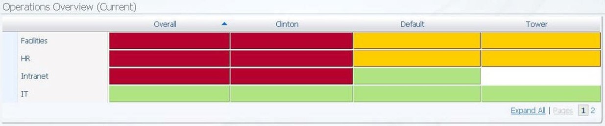
Figure 7.12: A representative sample of a stoplight chart.
Stoplight charts provide notification to the user similar to how stoplights notify drivers when they are required to stop or allowed to proceed through an intersection. With stoplight charts, however, the red color indicates poor performance of the metric in the column for the service in the row. Green indicates acceptable performance, while yellow indicates some measurement inbetween. The power of stoplight charts comes in the ability to identify specifically what each color means. Thus, for different charts, the measurement for "green" and "red" can and is likely to be different.
The value in this abstraction comes when the business decides to later manipulate the values for what they assume to be "good" versus "bad". The chart and its notifications need not change, but the data the drives that chart changes on the back-end.
Heat Charts
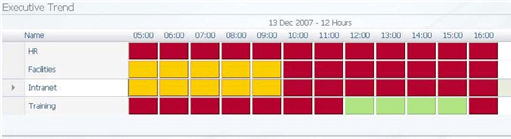
Figure 7.13: A representative sample of a heat chart.
Heat charts are a particular type of stoplight chart that occurs over time. As you can see in the chart above, the service "Intranet" experienced a period of "middling" performance between the hours of 05:00 and 09:00, followed by a drop into "bad". These charts are particularly powerful over and above stoplight charts because they show an extra axis of data, namely the value of the stoplight color over time.
Business Calendars
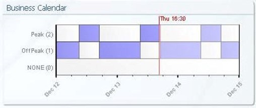
Figure 7.14: A representative sample of a business calendar.
When businesses move to global operations, the spread of time zones between sites and business services adds a layer of complexity to scheduling outages and providing peak levels of service. Business calendars assist the consumer with identifying the peak and non-peak levels of service when calculated across all time zones. This information comes in handy in identifying the best times of day to perform activities on the system.
Service Quality (Real Time) Charts
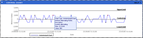
Figure 7.15: A representative sample of an instantaneous or point-in-time service quality chart.
BSM is all about service quality that directly impacts the business, and these chart types are a representative sample of showing service quality at an instantaneous moment in time. The chart above shows for each of the services being measured how well those services are performing. As with any of the other charts, the power with these charts is the ability to change the validation logic in the background as the business identifies new or updated thresholds for what is considered quality service.
Service Quality (History) Charts
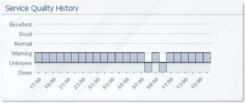
Figure 7.16: A representative sample of a historical service quality chart.
Similar in function to the chart that Figure 7.16 shows, but adding in the extra axis of time, historical service quality charts provide historical quality information to the consumer. Similar in difference between stoplight and heat charts, these charts give the consumer information about when a particular service may have regressed into poor quality. In the example above, the measured service is performing very poorly, with two movements into the completely "down" state.
Image Maps
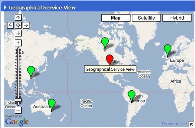
Figure 7.17: A representative sample of an image map.
With any of the charts we've talked about thus far, it is occasionally useful to plot them against an image of some form. That image enhances the visual notification associated with the metric. Most often, these image maps are area maps or geographical maps, but they can relate to any image that makes sense to the user and the metrics chosen. As you can see in the image above, we are relating status—"red" versus "green"—to particular areas on the globe.
Drill-Down Reports
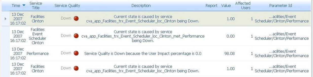
Figure 7.18: A representative sample of a drill-down report.
With any of these elements, the ability to create hyperlinks from data block to data block provides a level of added information to the user. In this case, drill down reports provide specific information that describes why a graphic is represented in the way it is. In the case above, clicking on a representative image drills down to specifics about individual services and their status.
Service Trees
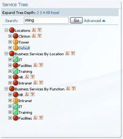
Figure 7.19: A representative sample of a service tree.
Relating service quality and drill downs in another fashion are service trees. These types of charts allow the user a single-view look at multiple metrics in a tree-view. Here, we can see the rollup status of various services. By clicking on the plus sign next to any service, we drill down to the dependant services below the major header. Creating multiple levels, often based on the service model itself, provides the user a single-glimpse view of the entire environment. Linking service tree data blocks to drill down reports provides the consumer with a holistic way of determining exactly what is causing problems in the environment.
BSM and its Visualizations Provide Return through OPEX Reduction
Operational expenses are recurring, which means that reducing them impacts the bottom line over and over again. As we've intended to show in this chapter, the implementation of BSM into a business service environment can provide a measure of return to many different user classes. Management and financial individuals gain rich access to data with high resolution and low turnaround. IT gains a single management interface for performing their regular activities with systems and applications. End users also gain through greater understanding of the state of the system they are using. All of this arrives through the data collected and calculated through the BSM system.
In our next chapter, we'll close out our three-chapter series on obtaining maximum value from a BSM implementation. There, we'll focus on the benefits gained by IT. We'll talk about how IT can tie BSM information in with business data, service desk data, and other infrastructure metrics. We'll also focus on how BSM can model different types of data (from infrastructure data to business data) to generate meaningful information back to the users. As a result, targeted user groups can make more informed quality decisions in their day to day work.