Report Formatting for Success with SAP BusinessObjects
Introduction
Being able to produce high-quality reports is the main differentiator between an average report developer and a reporting professional. This paper will focus on the finer points of report development as they relate to SAP BusinessObjects Web Intelligence to help you get to the next level quickly.
We'll also be working exclusively in the report panel to provide you with tips for creating the optimal analytical experience for your business users. This paper assumes that you've already queried your data source and are ready to create professional-class reporting documents with the data retrieved. Before we get started, let's cover a little housekeeping and briefly discuss viewer settings. You'll have an opportunity to choose from two types of viewers for reading and modifying reports.
Setting Personal Preferences
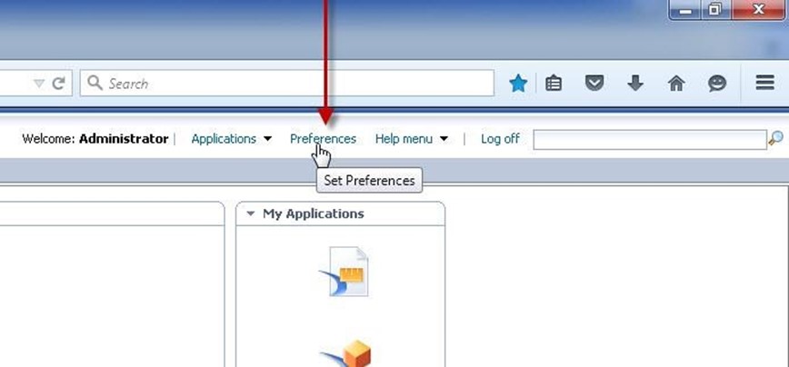
From the BI Launch Pad, click on Preferences located in the upper right corner as pictured below.
Accessing your preferences will allow you to make changes to several settings associated with your logon. The choices range from general settings about working within BI 4.1 to more specific settings about viewing Web Intelligence reports and Crystal Reports.
From the General tab you'll be able to select a default folder that you'll be taken directly to when you log on to BI 4.1. This is helpful because it saves time and takes you right to the content that's most important to you. You'll also have the opportunity to select several different descriptive attributes about published reports.
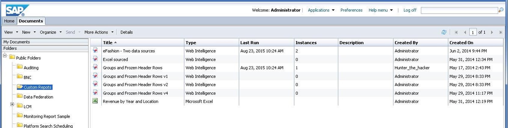
These attributes will give you information at a glance about the reports published to the SAP BusinessObjects platform pictured below. Depending on the size of your monitor, you might prefer a long list of reports to appear on the same page without having to go to the next page. This setting is also pictured below.

By making the selections above, viewing the contents of a folder in BI 4.1 will appear as below. You'll be able to see the report title along with the date of its last scheduled refresh, number of instances, who created the report, and creation date.
Changing Web Intelligence Preferences
To choose your reporting settings, click Web Intelligence from the list of preference choices. My personal preference is to use the HTML viewer to View reports and the Applet (JAVA) viewer to Modify reports (as pictured below).
The HTML viewer is faster, cleaner, and provides 99 percent of the same functionality as the Applet viewer. The Applet viewer still has a slight functional advantage though, because it allows you to create conditional formatting rules and to create a custom number format on a column. As long as you're not performing those two actions, the HTML viewer is the best choice.

Let's move on to the fun stuff and talk about reporting. It's important to understand that all modifications to a Web Intelligence report are done from design mode. Reading mode is designed specifically for viewing and analyzing data in a report, while design mode is for making report modifications.
Designing Reports for a Specific Purpose
The first rule of thumb when creating reports is to understand how the reports will be used. This single detail will give you most of the information you need to start creating reports. There are quite a few other questions you could ask that are also helpful, but knowing how users want to see the data will get you designing on the right path. Below are the four primary ways that users will often use Web Intelligence reports:
Viewing on demand
Reports will be published to the BI 4.1 platform and available anytime for user consumption when users need it. Scheduling these types of reports saves time and allows users to log on and view the latest instance of a report rather than the user having to refresh a query after every report.
Interactive viewing is a common need when reports are viewed on demand. Most users will expect to interact with a report by drilling into the data using filters. Web Intelligence has no shortage of choices here with the following options available to report developers or power users:
- simple report filters—also known as the filter bar
- input controls—powerful and dynamic filtering
- block filtering—enter design mode and apply specific filters to individual data tables and charts
On-demand viewers are usually more willing to see your innovative creations of Webi dashboards and visual reports. Interview a frequent user to get ideas and an understanding for what information users would like to have. If you can include some of those ideas in your designs, you might get user acceptance quicker than expected.
Consuming raw data
Many users will want a raw data pull of the results. Rows and columns are all they'll need. As a report developer with a bag of tricks, so to speak, you'll want to give them much more than a plain old block of data, but you have to remember to give them what they want (But, tell them you can do more if they ever need more than rows and columns of data). Many longtime business users, especially in finance, will have downstream processes that require data feeds from the warehouse to be in a specific format.
Developing reports for mobile delivery
Some users will expect to read results on their phone or tablet. If this is the case, you'll need to create reports carefully and design specifically for mobile delivery by using summarized data at a high level. Dashboards, storyboards, and summary reports are more ideal for mobile delivery than reports with large row counts.
Creating ad-hoc reports
Self-service reporting is a much talked about area of BI reporting, but it's not always the most effective. However, it can be done, and SAP BusinessObjects and Web Intelligence is the perfect solution for self-service ad hoc reporting. At the universe level, save objects into clearly labeled folders based on contexts. This style of universe design will give your users a path to follow with minimal, albeit some, instructions.
Those are the basic ways that consumers will use your reports. Understanding their goals beforehand will save time and frustration for both you and your users when your first drafts closely match their needs and expectations.
Using the Whole Page
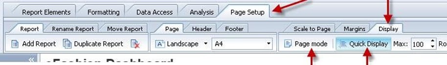
Adjusting page settings can be very helpful depending on the final delivery format of the report. If the goal is to print a report or have it exported to a PDF, then you should design your reports to fit perfectly within a page. By default, Webi reports are in Quick Display mode. To change the mode of the report, click the Page Setup tab and then select the Display subtab. Toggle between the Quick Display option and Page Mode option as pictured below.
Quick Display Mode
The quick display mode is designed exclusively for analyzing data on the screen. It's the perfect setting for viewing large row counts and filtering results with input controls. But if you plan to print report without making any page setup changes, you might be disappointed. Notice the excessive amount of margin space applied by default, as pictured below.

This can be easily fixed by clicking the Margins subtab (still within the primary Page Setup tab) and making manual adjustments of the margins. The default margin sizes (when viewed in inches) are as follows:
- Top: 0.79
- Bottom: 0.79
- Left: 0.79
- Right: 0.79
- Header: 0.55
- Footer: 0.47
To design a report to be printed or exported and distributed as a PDF, it's a good idea to switch the display type to Page Mode and design your report within this setting.
Changing Margins
Click the Margins subtab and change the margins to: 0.40. It's a good starting point and you can adjust further if necessary. Margins set at 0.40 will allow you create a nice looking report without excessive white space on the top, bottom, and sides.
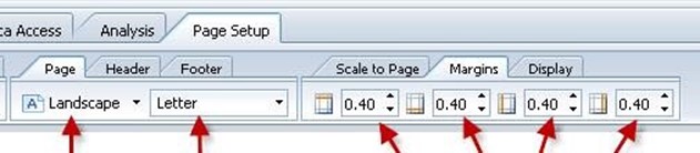
Landscape and Page Size
You can also switch between portrait and landscape settings for the page layout and choose from twenty-four different page sizes. For a standard business paper size, switch to letter. These settings are all pictured below.
Headers and Footers
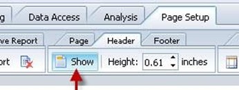
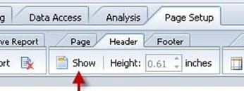
Headers and footers are turned on by default in Web Intelligence. Quite often they are very helpful by providing the obvious uses of holding a page title, date, page number, etc. But they can also be unnerving when you prefer not to use them. Since headers and footers are on by default, you'll have to manually hide them when they're not needed. This is easily done by toggling them. Click the Show button to turn them off or back on.
Header On
Header Off
It's worth noting that headers and footers do not export to Excel. This can either be perfect for your users or a pain point. It all depends on what information they'd like to see in their exported file. Many users will never need to export a report, but it's common for scheduled reports to be distributed to email addresses in XLSX files.
Adding Logos
Another use for headers is the requirement to display a company logo. Select a logo and then choose how to display it. Here are the steps:
- Right-click inside of the page header and select Format Header.
- Click the Appearance section.
- Select the Image from file option and click the Add button.
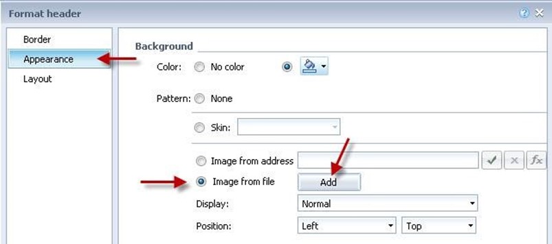
Next, you'll be able to assign a position. Some design standards require logos to be on the right while others require it to be left or center. Make this change from the Position setting.
Logos and other images can also be added to blank cells for custom positioning on the report canvas.
Page Footers
Page footers are commonly used for displaying page numbers or confidentiality statements. There are two predefined page number settings available in the Report Elements tab and Cell subtab. Pictured below are the predefined options available.
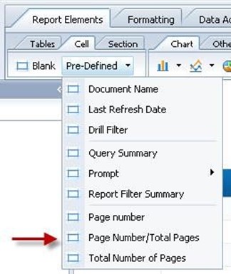
Use the following steps to see the available settings:
- Click the page footer.
- Report Elements tab Cell subtab
- Click the page number option.
- Click the location within the page footer.
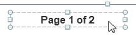
By choosing the "Page Number/Total Page" pre-defined cell, the result will appear as below.

You can tweak the formula (in the formula bar) with the following simple steps to make a small but useful change in the appearance of the page numbers:
- from
- =Page()+ "/" + NumberOfPages()
- to
- ="Page "+Page()+ " of " + NumberOfPages()
Below is the updated page number format based on the second formula listed on the previous page.
Now we'll move on to various changes you can make when displaying data.
Working with Data and Data Tables
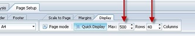
Consistency in style and format plays a crucial role in professional reporting. Various table attributes such as fonts, font sizes, and even column heights play an important role. Tables are the structures used for displaying rows and columns in Web Intelligence. They can be 20-row summary blocks with 100,000+ rows of granular and detailed data. You can extend the number of rows to appear on a page by clicking the Page Setup tab and Display subtab. The default number of rows per page is 100 and the default number of columns is 20. These can be reasonably increased to 500 and 40 as shown below.
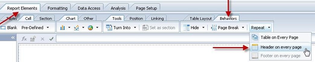
If the number of pages in a report is more than a single page, you won't see headings on your data tables unless you turn them on. This is done by the following steps:
- Select the data table.
- Click the Report Elements tab.
- Click the Behaviors subtab.
- Click Repeat and choose Header on every page.
Cleaning up the Cells
You should consider changing a few settings when formatting your data tables. The height of data rows is one of them. Rows and columns of data appear cleaner and easier to read when various attributes are modified slightly. Below are a few of the main settings that can be changed to give you an optimal and consistent appearance. The list applies to both the data and column headings:
- Font size
- Column alignment
- Column height and width
- Padding (horizontal and vertical)
The default font size in Web Intelligence is 9, but many users prefer 8. This can be easily changed to provide a more ideal size for your users. But when the font size changes you'll also need to consider changing the row height in the table. The height of 0.22 works perfectly with font size 8.
After changing the attributes of the data being displayed, you'll find that the table headers are out of proportion and will also need to be lowered to match the size. Since the table headers are set as bold by default, they'll appear larger at size 9.
Formatting Column Headers
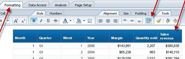
Two additional settings, word wrap and padding, should be applied to column headers to clean up the appearance. Below is a sample of how the column headers would look when only reducing the font size.
Apply word wrap by clicking the Formatting tab and Alignment subtab. The image below shows how the sales revenue column header looks when wrap is applied. Each column header will need to have wrap applied. Also notice in the screenshot below that excessive spacing appears in the column header, which is caused by the default settings in the padding attributes. Modify the padding values to eliminate some of the unnecessary space above and below the column header values. Note: Padding also applies to data values, not just column headers. Horizontal padding is applied to data values by default. Without it, the data would be flush against the boundary.
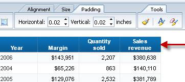
Below is the same table with updated formatting applied to the column headings using the following settings:
- Padding was set to horizontal 0.02 / vertical 0.02.
- Alignment was centered.
- Wrap was applied to every column.
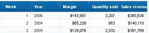
Alternating Row Colors
Some users prefer to have tables with rows in alternating colors while others prefer no color at all. Be sure to check with your client's or company's style guide before adding alternating background colors. After you get the approval, here is how to apply these attributes in Web Intelligence:
- Start by selecting the table to apply the formatting to.
- Right-click.
- Select Format Table.
After the Format Table window is launched you'll be able to make several changes to the appearance and functionality of the table. Alternating row colors is applied by clicking on the Appearance grouping and locating the Alternate color section as shown in the following screenshot .
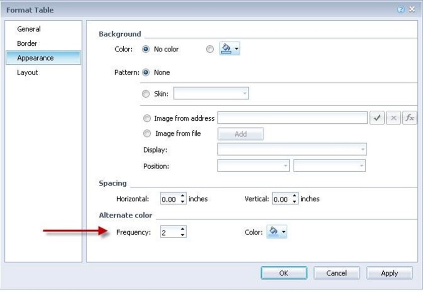
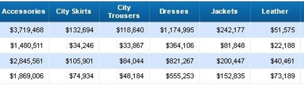
The frequency can be set for any number, including 0. Set it at 0 to eliminate the alternating background color. Set it at 2 to alternate colors on each row. You'll also be able to select the color to alternate between. Below is a look at alternating colors in a standard Web Intelligence data table.
Charting Your Way to Better Reports
Charting brings an added dimension to business reports by making them more engaging. Much has been said about dashboards lately and the power of displaying data visually. With Web Intelligence, we can take advantage of the recent visualization trend by creating report-dashboard hybrids. And with some careful design, we can create dashboards in Web Intelligence.
A dashboard is summarized information displayed visually on a screen that doesn't require scrolling and gives users the opportunity to interact with the data. This can all be done in Web Intelligence using a combination of the following:
- taking advantage of the improved charting engine in BI 4.1
- input controls and filters in the Filter bar
- element linking between components
- the Hide When function available to all charts and data tables which allows you to dynamically show or hide tables and charts based on a conditional value
A common business requirement for creating dashboards in Web Intelligence is the need for summarized visual information and detailed data in the same document. This is the perfect scenario for a Webi dashboard-report combination.
Configuring Chart Properties
Much emphasis has been placed on charting in Web Intelligence by the product developers at SAP. As a result, every chart has over one hundred modifiable properties. Take the following steps to edit chart properties:
- Right-click on a chart.
- Select Format Chart to launch the chart editor.
Properties are categorized in eight major categories, each having several properties that can be adjusted. One of the most powerful is the palette and style grouping. Use this category to apply formatting in the following areas:
- 3-D Look
- Palette
- Marker: line symbol, size, and palette
- Chart Series Style
- Light and Shadow Effects
Below are the preset choices available for assigning Light and Shadow Effects to charts.
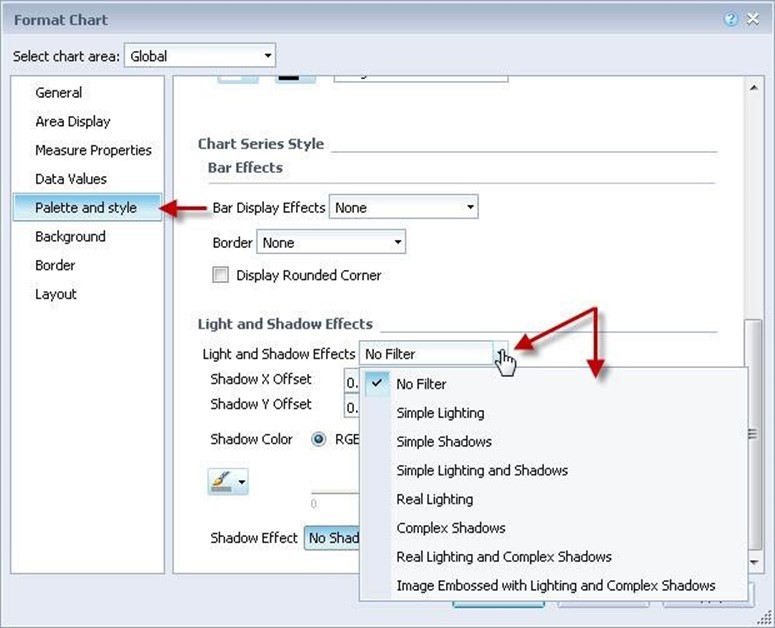
Trends in charting have been to minimize or even eliminate 3-D effects from charts. Because of this trend, you might want to consider using Simple Shadows or Simple Lighting and Shadows options rather than the 3-D setting located at the very top (not pictured) of the Palette and style property window. The Light and Shadow Effects options give charts an extra quality that improves their attractiveness without going over the top with obnoxious three-dimensional shadowing. These settings are subtle and clean, making them useful in just about any professional setting.
Explore other settings in the Format Chart window to fully customize your charts to increase user acceptance and most of all, most accurately communicate the data being charted.
Charts should be used to easily communicate results, not confuse viewers.
Dynamic Positioning of Tables and Charts
Relative positioning is used to keep the same amount of space between charts, tables, and freehand cells, even when filters have been applied. This feature is often overlooked but will be a much needed addition if your reports contain multiple data tables and/or charts. To set up relative positioning, start by placing an object on the report canvas to serve as the "anchor" element. The position of the next object should then be configured to display relative to the anchor element.
Two settings can be applied when setting up the second object's layout position. The amount of spacing is also configurable. These settings are extremely useful because they help maintain a standard layout of report elements. This will become very important as your users begin drilling and filtering the data on the report. These settings are pictured below.
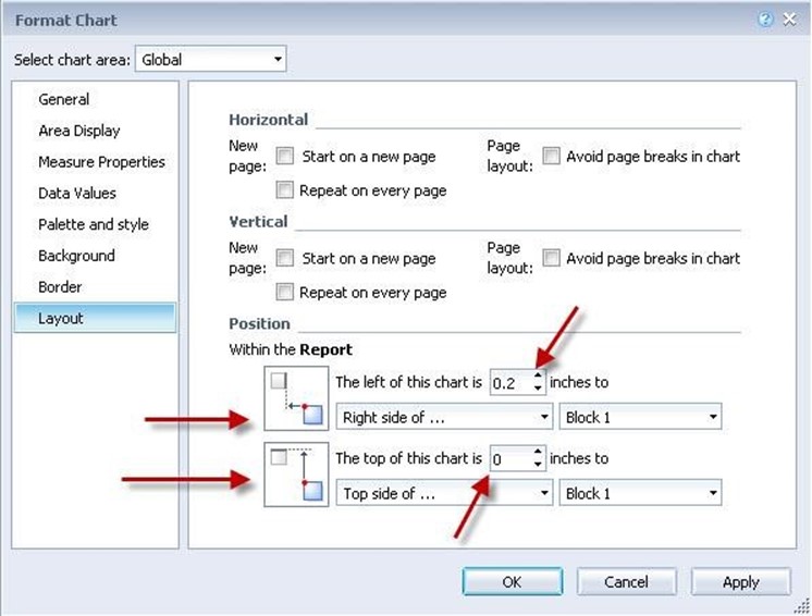
To access the relative position setting, right-click on a chart or table, and select either Format Chart or Format Table, depending on the element type that you're assigning relative positioning to. When the Format Chart window launches, select the Layout grouping and then locate the Position settings. Positioning can be applied to objects using any of the options listed below:
- sides
- left edge of report
- left side of...
- right side of...
- top/bottom
- top edge of report
- top side of...
- bottom side of...
Custom Groupings
Sections and breaks have been used in Web Intelligence for several years for grouping and data in reports. These functions are still very handy tools and can be enabled in as few as three clicks. In addition to these standard report features, now in BI 4.1, you have the opportunity to create custom groups. It's a powerful new addition and takes the place of writing time-consuming multi-part IF statements.
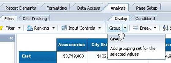
To begin using the new group feature, start with a data table that contains at least one dimension object:
- Select the dimension object inside the table.
- Click the Group button, located in the Analysis tab and Display subtab (pictured below).
Clicking the Group button will launch the Manage Groups window and allow you to check any number of values to apply as part of a new custom group. Click Group to create the new group with the collection of values selected as pictured below.
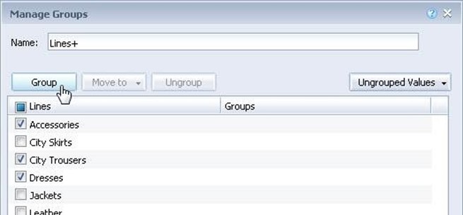
You can then create additional groups with the remaining values or create an "Others" group for any remaining ungrouped values. Give the collection of groups a name and you're ready to begin using the new custom group as an object in tables or charts anywhere in the Webi document.
Hidden Toolbar Gems
With so many features available to developers and power users in the ribbon toolbar, a few can go unnoticed. Try to familiarize yourself with all of the functions to be sure that you're taking full advantage of what Webi has to offer. From an interactivity perspective, the Analysis tab provides several useful functions.
Everything available inside the Analysis tab is described below:
- Filters tab
- Filter — Apply block and report filters.
- Ranking — Add top or bottom rankings to a table or chart.
- Input controls — Create a control for filtering report data with the following control types:
- Entry field
- Combo box
- Radio buttons
- List box
- Calendar
- Spinner
- Simple slider
- Tree list
- Check box—for multiple sections
- List box—for multiple sections
- Double slider—for multiple sections
- Tree list—for multiple sections
- Data Tracking tab
- This modifies the format for data table values when tracking changes has been enabled, the queries used in the document have been refreshed, and the values have changed.
- Display tab
- Group — Create a custom grouping from a dimension object.
- Break — This is one of two methods for grouping data.
- Sort — Apply ascending, descending, or custom sorts.
- Conditional Formatting tab
- Conditional rules are used for creating scorecards in a Webi report. Apply distinct formatting when user-defined conditions are met.
- This is available only when using the Applet (JAVA) viewer.
- Interact tab
- Drill —This is used when a hierarchy has been applied to a series of objects at the universe level and all dimensions are in the report. Users can drill up and down the hierarchy when drilling is enabled.
- Filter Bar —This was previously known as simple filters. Use objects from the query to serve as simple drop-down filters for an entire report tab.
- Outline — Expand and collapse sections and breaks.
- Functions tab
- Functions — This provides a quick way of adding basic calculations to objects in a data table and includes:
- Sum
- Count
- Average
- Min
- Max
- Percentage
Conclusion
Paying close attention to the details will make a big difference in the final quality of your reports. Taking advantage of the numerous features in Web Intelligence will allow you to create complete reporting documents for the most effective analysis. Whether report consumers in your organization are power users with developer skills or analysts that only view reports, you'll be able to satisfy either audience with the flexibility in Web Intelligence.